Introduction
When I had time at Eastman, I’d visit their periodical room at the Sibley Music Library and look for the most recent copies of Gramophone and Early Music magazines. The first was made for listeners, and the second for scholars. Both offered formal reviews of recorded albums.
I remember loving to read those.
I didn’t think much about it, but once I’d established my first website biberfan.com, I found myself writing about music. And I tried writing some reviews. I also wrote essays and stories and like anyone at the time my age, I was dabbling with HTML and learning how to create websites. It was a mess. But it was the start.
This past month I’ve been preparing to leave my web service Squarespace that I’ve enjoyed using for my music reviews for nearly a decade. The service is easy to use and they have great-looking templates. But I’m in a place now where I wanted to tinker more and that’s really not the platform for that. I brought my Biberfan site back to the familiar WordPress and spent time on the site’s aesthetics, cleaning up old reviews, removing stuff that didn’t belong, and basically elevating things.
About year ago I added a link for “Buy Me a Coffee,” a service that allows visitors to “tip” you for your work. I’ve never liked the way ads fill up many sites and as far as I could afford the website, I didn’t want to use ads.
In essence, I’ve always wanted Biberfan to be the type of site I’d discover and want to read myself. Maybe in the comfort of one of those chairs at Sibley. Or at home, with a nice hifi setup?
Redesign
The feature the Squarespace theme I was using gave me was the display of the album art in a nice regular grid on the homepage. Wherein some sites have lists of new reviews or may show album art, the Squarespace page had a very definitive aesthetic, even though it wasn’t too fancy. It had elegance. Part of that is access to Adobe webfonts at no additional cost. Over the years I’d fuss with the background color but in the end, I’d adopted a shade that was pretty close to the original Macintosh computer’s light brown case.
This time around I wanted more details. I wanted more interaction. And I wanted to bring the theme of the site more into the world of baroque aesthetic: a serif font, art that conveys historical instruments, album covers wrapped in CD jewel cases.
The front page now doesn’t just give a continual scroll. Instead, it offers two rows of recent reviews, some random reviews, then access to the blog posts (musings) and podcast episodes (Bachcast).
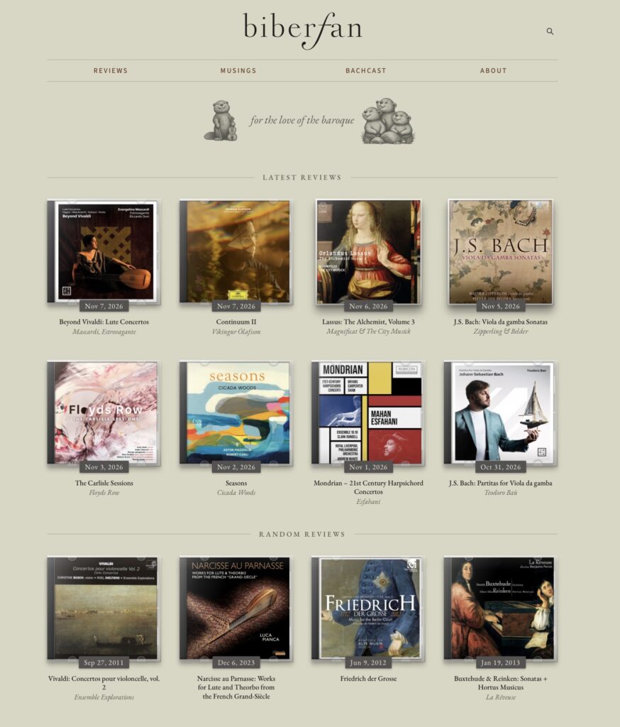
To make the album covers pop, I added shadow and you can see differentiation between the single CD and multi-CD sets. When you mouse over them, we get an excerpt and the star rating.
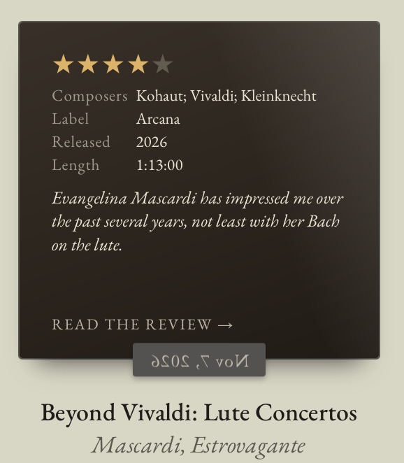
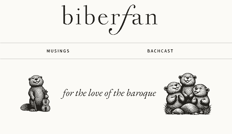
That little interactive piece, flipping the cover, does something to teach the visitor that these albums are something you can touch and play with. I hope it draws the viewer in. There’s also something lightly whimsical about it. And to add to that whimsy, I provide some animated beavers at the top of the page that do a small animation after 5 seconds.

Those who know what Biber means in German will understand the chosen mascot, I hope. Of course, I’m a Fan of Biber, not the animal, but the composer who lived from 1644-1704 and was a virtuoso violinist.
Step into the review itself and see the album art, this time bigger. This was what happened on Squarespace, but the images were too big! The art overwhelmed. And you also see below some metadata about this album. Putting this a consistent way in each review was a pain in the ass, because it relied upon a self-inflicted rule to always capture that information and to present it consistently. And that I did not like doing.
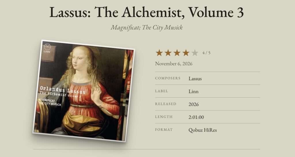
I often write titles in this format: Lassus: The Alchemist, Volume 3 • Magnificat; The City Musick. The logic now takes that performer name and puts it below the title with CSS.
But remember what I said about interactivity? The album isn’t straight. It’s rotated. Each album appears at a random tilt, just to get your attention. And hopefully you’ll be inclined to give it a click.
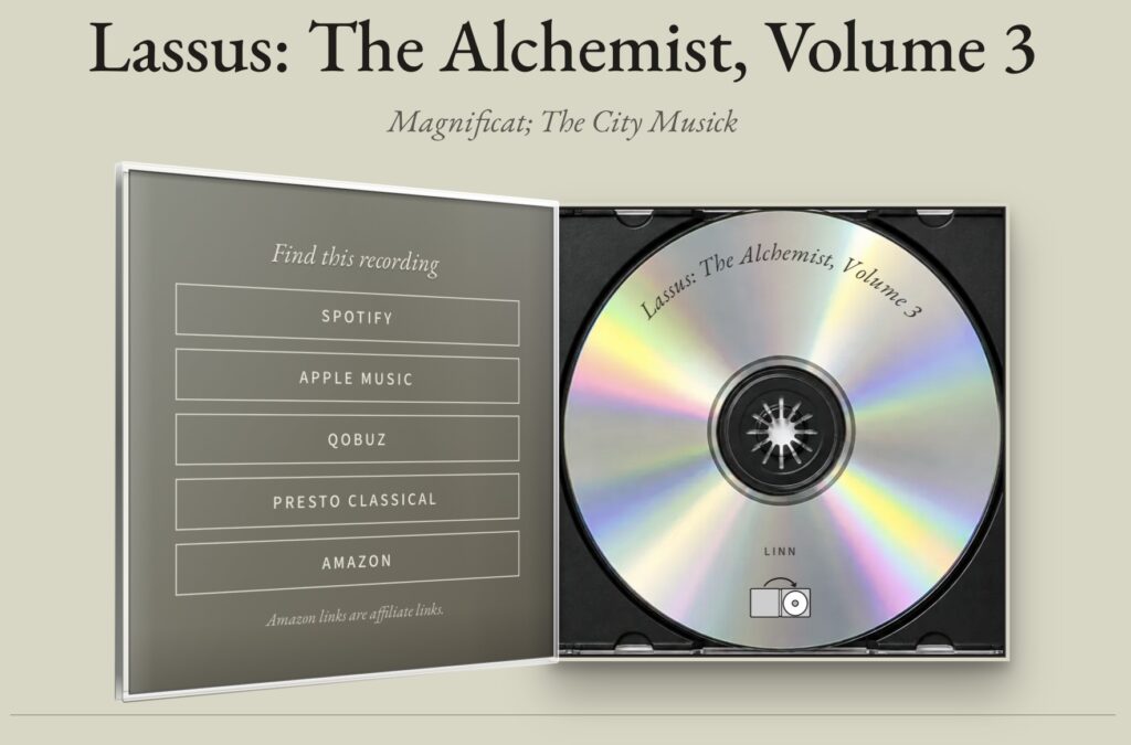
With the magic of CSS, we can superimpose content over the CD image background and in this case I take the title and record company, along with an SVG icon to indicate without language that you can close the album back up. It goes back into place and the metadata re-appears. Like magic.
Using the same art for the related and next/previous reviews would have been easy to do at the bottom of the review, but using the same look as the front page would have suggested that interaction did the same thing: flip the cover to see a rating. But in this case I didn’t want all that, so I changed the appearance so that it was clear, visually, that you could interact, but the interaction here is just a slight three-dimensional movement and a click takes you to that review. Just to show off a bit, I put the title of the review on the spine, again with CSS.
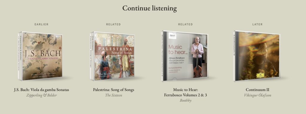
The key here was building some logic, which Squarespace had but WordPress doesn’t, to link one album to another. My solution looks at artists, labels, and composers. Those are how the related albums get chosen. The earlier and later posts are the chronological cousins of this review. In the case that no related album can be determined, the script will insert a random recording from the database.
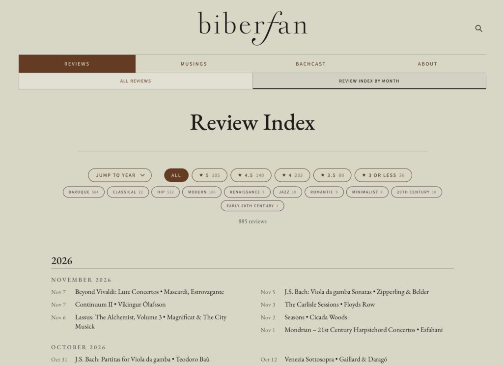
The final flourish to bring usability to the site was to give the old “continual scrolling page” experience when the user clicks “reviews” alongside an enhanced version of my old review index. This one has live filtering, allowing filter by review rating and by other tagged elements. I’m not currently done tagging everything, but I’ve built a spreadsheet view within WordPress to make that editing chore easier.
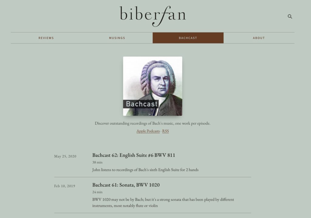
The podcast was something I had a separate blog for on Squarespace. Here, I use a different background color (as I do, as well, for Musings). I really wish people would use a tool like Apple Podcasts to subscribe, but some will discover the podcast through the website, which is fine.
And for the final flourish? Ah… boring media playback controls are not my thing. For this site we have some nicely upgraded ones, but for biberfan, I wanted to take it to another level.
I like hifi and audiophile listening experiences and one of the brands that has been at the forefront of hifi design is Bang & Olufsen. They’re famous for a standing multi-CD player and was inspired by that concept, of coming up to the player and waving your hand and watching as the glass panel moves and allows you to load the machine. I took the concept and built a media playback control that operates like a CD player.
One that plays CDs with beaver art.
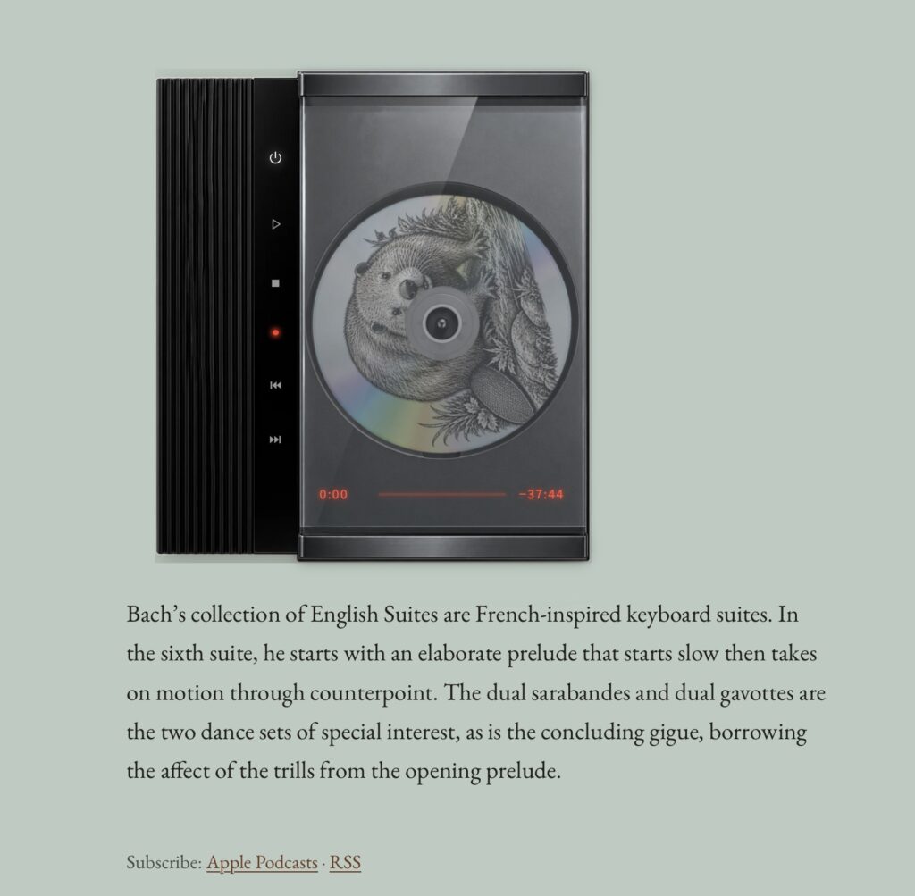
And of course, the CD spins when you play back the episode. Three different random beaver cover art options are available when you load a podcast.
Parting Words
If you like music I hope you’ll give some of my reviews a read, a few of the podcasts a listen. This is a hobby for me and one I gain satisfaction from, knowing that others come to convene with me to learn and share their love for music. Hoping this new site design makes the experience even better.
And no, my coding skill are not so sharp to allow me to develop all of this within 3.5 weeks. But knowing what’s possible and what I want in vibe-coding with Anthropic’s Claude has been not only fun but fulfilling.